
Lotus Fitness
A performance-focused brand inspired by inner discipline and the power of renewal.
Brand Identity & Digital Launch
Responsibilities:
Creative direction
Identity design
Motion design
Video production,Website Design
Challenge and Insight
LOTUS began as a lifestyle and athletic brand inspired by resilience, renewal, and the journey of rising above adversity. The name itself carries a deep symbolism: the lotus flower, emerging clean and defined from challenging conditions.
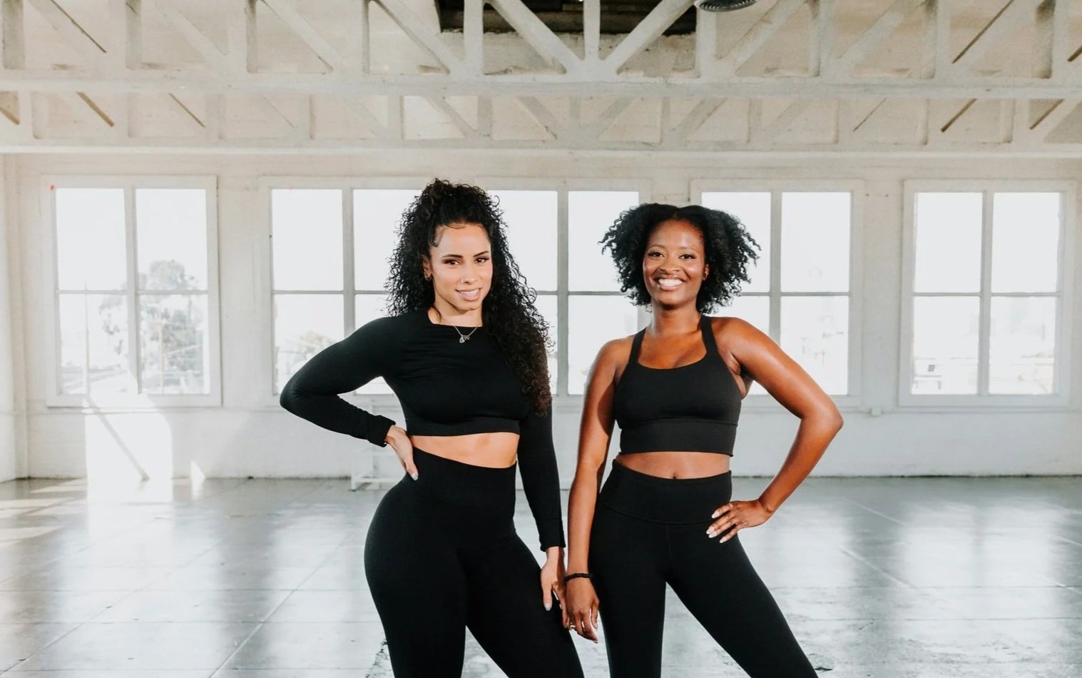
Through research, I identified a gap: Most fitness branding leaned heavily on aggression and intensity. Lotus needed to signal strength, but also approachability and balance, a brand that felt equally empowering for beginners and committed athletes.
The moodboard was the idea and feeling that Lotus wanted its community to have.
Mood board exploration
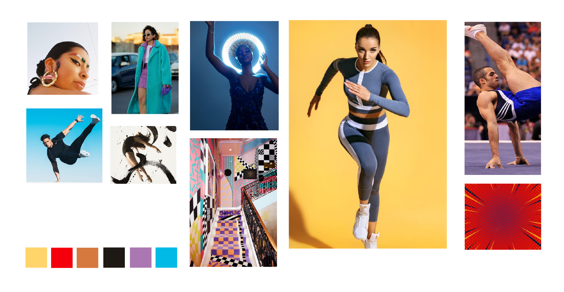
Comfortable,
Empowering,
Stylish,
Performance,
Durable,
Modern,
Comfortable, Empowering, Stylish, Performance, Durable, Modern,

Concept Development

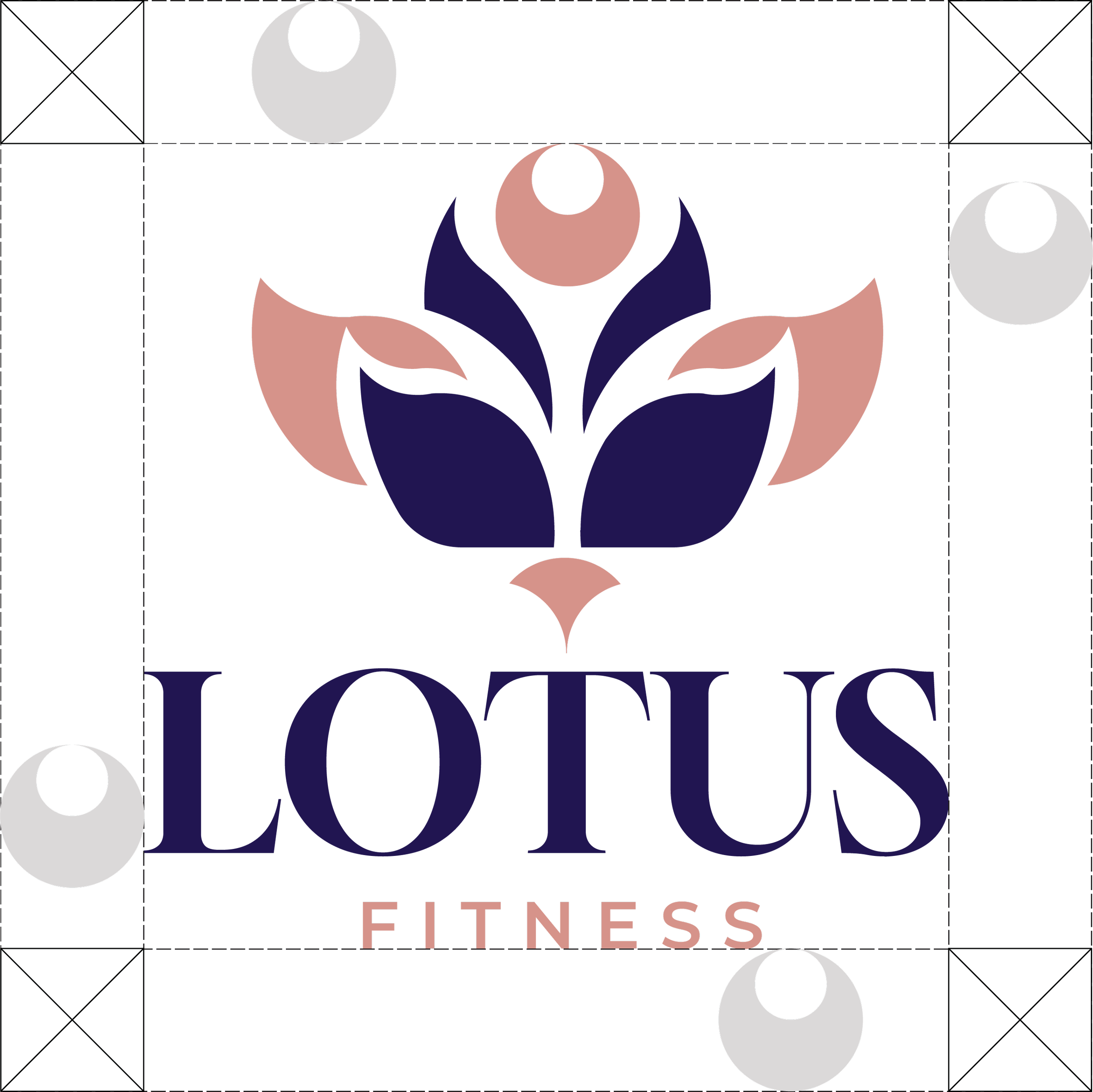
Design stage
Embodying what a modern fitness brand, geometric petals, clean vector style, balanced symmetry, bold lines, fitness-meets-nature aesthetic, professional branding mockup
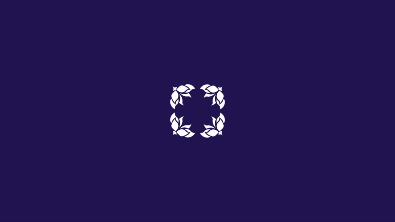
Final logo

Identity System


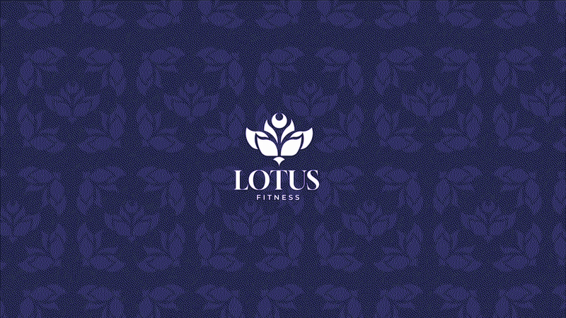
Mockups extended the brand seamlessly into merchandise, posters, and digital environments, including a launch video and animations which aimed at creating an elevated “brand moment,” drawing attention across channels.
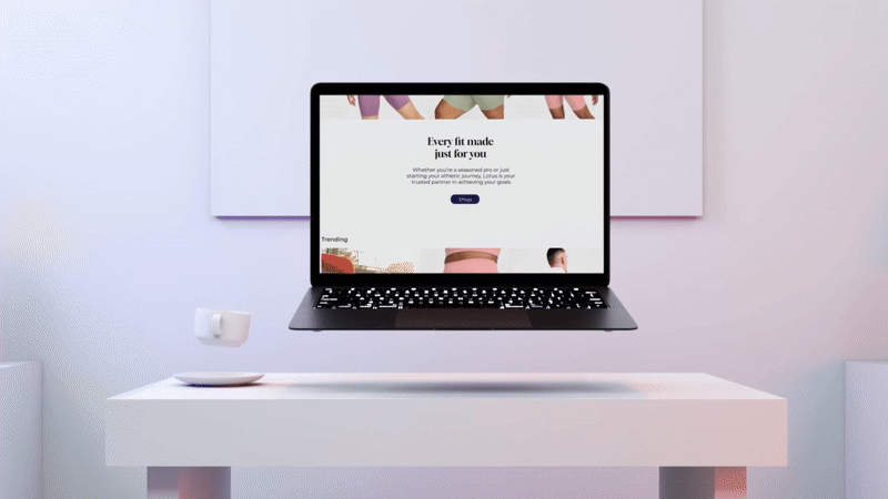
Applications (mockups, posters, social)


Reflection
The new Lotus identity positioned the brand as a modern, inclusive fitness player. The launch campaign drove a measurable increase in awareness.
What I learned: successful identity systems don’t just look sharp, they carry emotional resonance. Lotus taught me the importance of anchoring visuals in a clear brand insight; balance and growth lead to creating a brand system that is memorable and scalable.